Why Accessible Fonts Matter for Web Design
When it comes to designing a website, the choice of fonts plays a crucial role in creating an inclusive and accessible online experience for all users. The selection of accessible fonts goes beyond mere aesthetics; it directly impacts the accessibility of the content and the overall user experience.
The Importance of Choosing Accessible Fonts
Understanding the Impact of Typography on Accessibility:
Typography involves more than just selecting visually appealing fonts. It encompasses factors like font size, spacing, and color contrast, all of which contribute to the readability and accessibility of the content.
How to Select Fonts with Good Color Contrast:
Choosing font colors that provide a clear contrast against the background is essential for individuals with visual impairments or color blindness. High contrast ensures that the text is easily readable by all users.
Considerations for Font Size in Accessibility:
Opting for an appropriate text size is crucial for making content accessible to individuals with varying visual abilities. Larger fonts can enhance legibility and readability, particularly for users with low vision.
Guidelines for Web Accessibility with Fonts
Addressing Dyslexia with Font Choices:
For users with dyslexia, certain fonts may pose challenges in reading. Choosing dyslexia-friendly fonts with distinct letter shapes and clear spacing can significantly improve the readability of content.
Best Practices for ADA Compliance in Typography:
Adhering to the WCAG standards is essential for ensuring that your website is accessible to all users, including those with disabilities. Implementing accessible typography is a key aspect of achieving ADA compliance.
Choosing Widely Available Fonts for Accessibility:
Opting for fonts like Google Fonts or other widely available typefaces enhances accessibility as they are supported across various platforms and devices, ensuring a consistent reading experience for all users.
Enhancing Readability and Legibility through Typography
Serif vs. Sans Serif Fonts: Which is More Readable?
The debate between serif and sans serif fonts revolves around which style offers better legibility. While serifs can enhance readability in print, sans serif fonts are often preferred for digital content due to their clean and modern appearance.
Optimizing Letter Spacing for Better Readability:
Proper spacing between letters and words can significantly impact the readability of text. Adequate spacing enhances comprehension and makes it easier for users to navigate through the content.
Utilizing Typeface for Improved Legibility:
The choice of typeface influences how information is presented and perceived. Selecting a typeface that prioritizes legibility ensures that the content is easily readable across various devices and screen sizes.
Impact of Fonts on Web Design and User Experience
Ensuring Readable Fonts for Users with Low Vision:
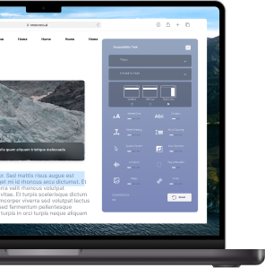
Individuals with low vision may require larger fonts or adjustable text sizes to comfortably read content. Providing options for font customization enhances the overall user experience and accessibility of the website.
Font Color Choices for Enhanced Web Content:
The color contrast between the text and the background significantly impacts the readability of the content. Opting for accessible font color combinations improves the visual appeal and comprehension of the web content.
Creating a Stylish Design while Prioritizing Accessibility:
Designing a visually appealing website does not have to compromise accessibility. By selecting accessible fonts and implementing ADA compliant practices, you can create a stylish design that is inclusive and accessible to all users.
Ensuring ADA Compliance with Accessible Font Practices
Key Factors for ADA Compliant Fonts in Web Design:
When developing a website, ensuring that the font choices align with the ADA requirements is crucial. Accessible fonts play a vital role in making the content accessible to all users and complying with accessibility standards.
Implementing Sans Serif Fonts for Better Accessibility:
Sans serif fonts are often preferred for digital content due to their clean and modern appearance. These fonts enhance accessibility by improving legibility and making the content easier to read for all users.
Meeting WCAG Standards with Accessible Typography:
By following the guidelines outlined in the Web Content Accessibility Guidelines (WCAG), designers can ensure that their typography choices contribute to an inclusive online environment that is accessible to all users.
What are some commonly recommended fonts for web accessibility?
- Arial
- Verdana
- Tahoma
- Helvetica
- Georgia
- Times New Roman
When choosing an accessible font for website accessibility, it is important to keep accessibility in mind. Some commonly recommended sans serif typeface fonts include Arial, Verdana, and Helvetica. These fonts have higher readability than serif fonts and are less decorative, making them easier for people with low vision to read. Additionally, ada-compliant fonts ensure that the font is accessible for all users, including those with disabilities.
It is recommended to use as few fonts as possible on a website in order to maintain consistency and ease of readability. Some websites may opt to use a custom font, but it is crucial to ensure that the font conforms to the web content guidelines for accessibility. Providing text spacing and using black text on a white background can also improve the font color to communicate information effectively.

