1. What Is the Best Font for Dyslexia?
Understanding Dyslexia-Friendly Fonts
Selecting an appropriate dyslexia-friendly font is crucial for enhancing readability for dyslexic readers. Sans-serif fonts like Arial, Verdana, and Calibri are recommended due to their clear and straightforward letterforms. Specialized typefaces, such as OpenDyslexic and Dyslexie, are designed for dyslexia and incorporate unique design elements to reduce letter confusion. Additionally, ensuring adequate letter spacing, avoiding italicized text, and using a larger font size can further improve reading comfort.
What Makes a Font Dyslexia-Friendly?
Dyslexia-friendly fonts incorporate specific design elements to enhance readability for individuals with dyslexia:
- Distinctive Letterforms: Unique and clear letter shapes help differentiate similar characters, reducing confusion between letters like 'b' and 'd'.
- Ample Spacing: Generous spacing between letters, words, and lines minimizes visual clutter, making text easier to follow.
- Heavier Baselines: Fonts with weighted bottoms provide a sense of stability, aiding in letter recognition.
- Simplified Letter Shapes: Straightforward and uncomplicated letter designs reduce visual confusion and improve letter recognition.
- Sans Serif Style: Fonts without decorative strokes (serifs) are often clearer and more legible for dyslexic readers.
Best Fonts for Dyslexic Readers
Top Recommended Fonts for Dyslexia
Selecting the appropriate font can significantly enhance readability for individuals with dyslexia. Here are some top recommendations:
- OpenDyslexic: A typeface specifically designed to mitigate common reading challenges associated with dyslexia.
- Lexend: A font family developed to improve reading proficiency by addressing visual crowding and other common issues.
- Arial: A widely used sans-serif font known for its simplicity and clarity, making it a good choice for dyslexic readers.
- Verdana: Features wide spacing and simple letterforms, enhancing legibility.
- Century Gothic: A sans-serif font with clear, distinct characters that aid in reducing letter confusion.
Is Comic Sans Dyslexia-Friendly?
Yes, Comic Sans is considered dyslexia-friendly due to its unique letterforms and sans-serif design, which reduce letter crowding and enhance readability for dyslexic individuals.
Is Arial Dyslexia-Friendly?
Yes, Arial is also regarded as dyslexia-friendly. Its simple, clean lines and sans-serif structure contribute to improved legibility for dyslexic readers.
3. How to Improve Readability for Dyslexic Individuals
Font Size and Spacing Considerations
Proper font size and spacing are essential for enhancing readability, especially for individuals with learning disabilities such as dyslexia.
- Font Size: Using a font size of 12-14 points (16-19 pixels) is recommended, as it strikes a balance between readability and fitting content within limited space.
- Letter Spacing: Increasing inter-letter spacing by approximately 35% of the average letter width can improve readability. However, excessive spacing may reduce readability, so it's important to find an optimal balance.
- Line Spacing: Adequate line spacing, typically 1.5 to 2 times the font size, helps reduce visual crowding and enhances text clarity.
Typography for Accessibility
Implementing accessible typography is essential to ensure that content is readable and comprehensible for all users, including those with visual impairments or reading difficulties. Key considerations include:
- Font Selection: Sans-serif fonts like Arial or Helvetica are often preferred for digital content due to their clean lines, which enhance readability. However, it's important to note that neither the Web Content Accessibility Guidelines (WCAG) nor Section 508 specify particular typefaces.
- Font Size and Spacing: Utilizing appropriate font sizes and adequate spacing between letters, words, and lines can significantly improve readability. Larger font sizes and increased spacing help reduce visual clutter and make text easier to read.
- Contrast: Ensuring sufficient contrast between text and background is crucial for readability, especially for users with visual impairments. High contrast between black text and a white background is generally recommended.
- Avoiding Overuse of Styling: Excessive use of bold, italics, or underlined text can be distracting and may hinder readability. It's advisable to use such styles sparingly and only to emphasize important points.
Accessibility and Dyslexia-Friendly Design
Making Your Website More Inclusive
Creating an accessible and inclusive website ensures that all users, regardless of their abilities or disabilities, can navigate and interact with your content effectively. Here are key steps to enhance your website's inclusivity:
- Adhere to Accessibility Guidelines: Implement the Web Content Accessibility Guidelines (WCAG) to meet international standards for web accessibility.
- Use Semantic HTML: Employ semantic HTML elements to provide meaningful structure, aiding screen readers and assistive technologies in interpreting your content accurately.
- Ensure Keyboard Accessibility: Design your website so that all interactive elements are accessible using a keyboard alone, accommodating users with motor impairments.
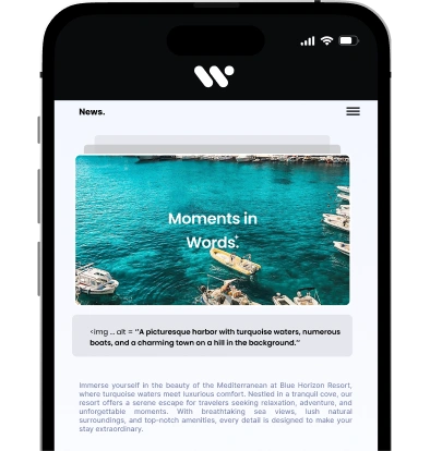
- Provide Alternative Text for Images: Use descriptive alt text for all images to convey content and function to users who rely on screen readers.
- Maintain High Contrast: Select color schemes that offer sufficient contrast between text and background, enhancing readability for users with visual impairments.
- Design Consistent Navigation: Create predictable and consistent navigation menus to help users orient themselves and find information easily.
- Utilize ARIA Roles When Necessary: Apply Accessible Rich Internet Applications (ARIA) roles to enhance accessibility, especially when native HTML elements are insufficient.
- Ensure Accessible Forms: Label form elements clearly and group related fields, facilitating ease of use for all users.
- Provide Captions and Transcripts for Multimedia: Offer captions for videos and transcripts for audio content to accommodate users with hearing impairments.
- Design for Cognitive Accessibility: Use clear language, straightforward layouts, and avoid unnecessary complexity to assist users with cognitive disabilities.
Steps to Reduce Visual Confusion
To minimize visual confusion between similar letters, consider the following strategies:
- Use Distinct Letterforms: Choose fonts with unique and clear letter shapes to differentiate between commonly confused letters like 'b' and 'd'.
- Increase Letter Spacing: Adjust letter spacing to reduce visual crowding, making it easier to distinguish individual letters.
Dyslexia, Education & Learning Support
Fonts for Students with Dyslexia
Selecting appropriate fonts can significantly enhance reading comprehension and comfort for students with dyslexia. Research indicates that certain fonts are better suited to address the challenges faced by dyslexic readers.
Best Fonts for Microsoft Word & Google Docs
Using Dyslexia-Friendly Fonts in Word & Google Docs
Selecting appropriate fonts in Word and Google Docs can significantly enhance readability for individuals with dyslexia. Here are some recommended dyslexia-friendly fonts and guidance on how to apply them:
Recommended Fonts:
- Arial: A sans-serif font known for its clarity and simplicity.
- Verdana: Offers clear letter spacing and simple shapes, enhancing readability.
- Times New Roman: A serif font that, when used appropriately, can aid readability.
- Lexend: Designed to reduce visual stress and improve reading performance.
- OpenDyslexic: A font specifically created to address common reading challenges associated with dyslexia.
Applying Fonts in Microsoft Word:
- Open Word: Launch Microsoft Word on your computer.
- Select Text: Highlight the text you wish to modify.
- Choose Font:
- Navigate to the "Home" tab.
- In the "Font" group, click the drop-down menu to view available fonts.
- Select your preferred dyslexia-friendly font (e.g., Arial, Verdana, Times New Roman).
- Set Default Font (Optional):
- To set the chosen font as the default for all new documents:
- Click the small arrow in the bottom-right corner of the "Font" group to open the Font dialog box.
- Click "Set As Default" and choose "All documents based on the Normal template."
- Click "OK" to apply the changes.
- To set the chosen font as the default for all new documents:
Applying Fonts in Google Docs:
- Open Google Docs: Go to Google Docs and open your document.
- Select Text: Highlight the text you want to change.
- Access Font Menu:
- Click the font name in the toolbar to open the font menu.
- If your preferred font (e.g., Lexend or OpenDyslexic) is not listed:
- Click "More fonts" at the top of the menu.
- In the "Add fonts" window, search for "Lexend" or "OpenDyslexic."
- Select the font and click "OK" to add it to your font list.
- Set Default Font (Optional):
- To set the chosen font as the default for the document:
- Click "Format" in the top menu.
- Select "Paragraph styles" > "Normal Text" > "Update 'Normal Text' to match."
- Then, click "Format" > "Paragraph styles" > "Options" > "Save as my default styles."
- To set the chosen font as the default for the document:
Additional Tips:
- Font Size and Spacing: Utilize larger font sizes (12-14 point) and increase spacing between letters and lines to improve readability.
- Consistency: Maintain consistent font usage throughout your document to avoid distraction.
- Avoid Overstyling: Use bold, italics, and underlines sparingly, as excessive styling can hinder readability.
You may be interested in: Discover the best fonts for, Web Accessibility Insights Best Practices, ADA Compliance Software Solutions


