


Font Size and Accessibility: Best Practices and Wcag Compliance
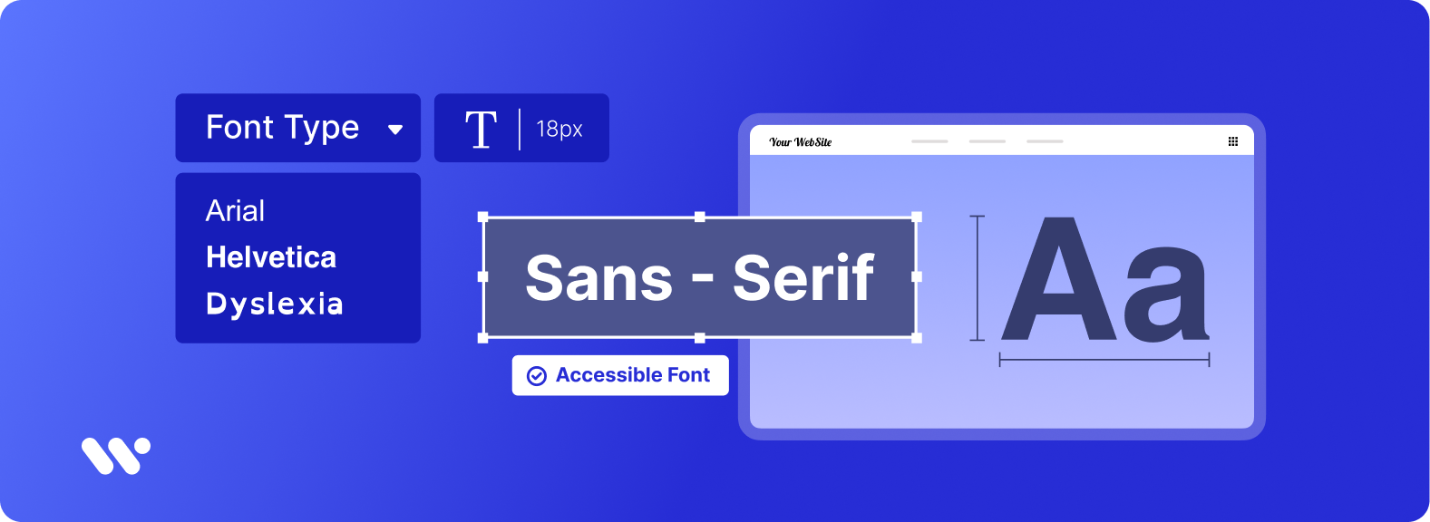
Accessibility font size is a crucial aspect of ADA compliance and WCAG guidelines when it comes to accessibility in mind. The official minimum font size for body text is usually 16px, but it’s recommended to use accessible fonts like sans serif to ensure text can be resized without loss of content or functionality.
In order to cater to people with low vision, it’s important to have a minimum font size for accessibility that can be resized without assistive technology up to 200 percent without any loss of content. Using sans serif fonts for body text and ensuring proper text spacing can help with accessibility issues.
Font size and accessibility are critical factors when designing a website to be wcag compliance and meet ADA guidelines. The minimum font size required for accessibility is typically 16px to ensure that body text is readable for all users, especially those with low vision.
It’s recommended to use sans serif fonts for better accessibilityfont size requirements for ADA typically include resizable text without the use of assistive technology up to 200 percent without loss of content or functionality. By following WCAG guidelines and keeping accessibility in mind, websites can ensure that their content is accessible to all usersassistive technology to resize text. It’s important to use accessible fonts and ensure that all text can be zoomed or resized without assistive technology up to 200 percent.
According to the Americans with Disabilities Act, websites must also adhere to an official minimum font size to prevent accessibility issuesresponsive design and proper text spacing, websites can ensure that their content remains readable and WCAG success regardless of the web browser or device being used.
What are Fonts and Typography?
Fonts and typography play a crucial role in making a website accessible to all users. Web designers must adhere to accessibility guidelines, including ADA compliance and WCAG success criteria. This includes using fonts that are easy to read and at a minimum size of 12 pixels or points. Some of the best accessible fonts include Calibri and Times New Roman. In addition, fonts must be able to be resized appropriately across multiple devices, with a minimum font size for ADA compliance and WCAG of 200% zoomed.
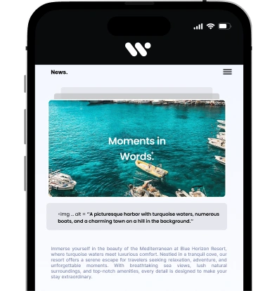
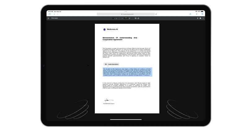
When using images of text, it is important to provide captions and alt text to ensure that users can understand the content. Fonts may vary in size and type, but they must be able to accommodate smaller font sizes for certain requirements. The font should be original size, resizable, and accessible to all users, making it easier to read.
Headings and large text should be used to break up content and make it more digestible. Font sizes should be consistent and meet the minimum requirements for accessibility. Text must be able to be resized without losing clarity, ensuring that users may still access and understand the information.
Ultimately, fonts and typography are essential components of a website's design. By following ADA font size requirements and using accessible fonts, web designers can create an inclusive experience for all users. Fonts should be not too small or large and have a font color that is easy to read, making the text size without losing clarity.
The importance of fonts in web design and accessibility
Font and font size are crucial elements in web design as they contribute to the overall accessibility of a website. The WCAG guidelines recommend specific font size requirements for ADA compliance, with a minimum font size of 1.4.12 for text spacing. It is important to use certain fonts and ensure that black text is accessible for users to zoom in to 200% if needed.
Many websites must use font color and font types that meet the recommended standards for body text, especially for footer text and small text that allows users to increase or decrease the font size accordingly. Captions and images of text should also be accessible and able to resize to an accessible size.
Fundamental Concepts
It is essential to consider accessibility when designing website fonts. Ada compliance and wcag font size requirements are necessary to ensure that font is accessible. The minimum font size recommended for body text is 1.4.12, with font size requriemnts for ada at a percentage that allows text to be zoomed to 200.
What is a font size Accessibility?i
Accessibility minimum font size refers to the ADA compliance font size and WCAG minimum font size requirements for font size on websites. The accessibility team recommends ensuring that text is not too small, as text smaller than the 1.4.12 text spacing can be difficult for some users to read.
Differences between serif and sans-serif fonts
One of the main differences between serif and sans-serif fonts lies in the presence of small decorative strokes at the end of the characters in serif fonts. These strokes are called serifs and are believed to improve readability in printed materials. Sans-serif fonts, on the other hand, do not have these decorative elements.
What is typography for accessibility?
Typography for accessibility is the practice of using fonts and text styles that are easy to read and understand for all individuals, including those with visual impairments or other disabilities. Choosing the right typefaces and font sizes can make a significant difference in how information is perceived and accessed.
In addition to using clear and legible fonts, typography for accessibility also involves considerations such as proper spacing between letters and lines, adequate color contrast, and avoiding distractions like overly decorative typefaces. By prioritizing accessibility in typography, designers can ensure that their content is usable and inclusive for all users.
Font Selection For Accessibility
When selecting fonts for accessibility, it is important to consider legibility and readability for all users. Sans-serif fonts are generally recommended for easier reading on screens, while serif fonts can be more difficult to read. It is also crucial to choose a font size that is large enough for those with visual impairments.
Choosing the right font based on usage scenarios and accessibility
Choosing the right font is crucial for multiple reasons, such as usability and accessibility. When deciding on a font for a website or document, it is important to consider the usage scenarios and the audience's needs for optimal readability and understanding.
For example, sans-serif fonts are typically easier to read on screens, making them a good choice for digital content. On the other hand, serif fonts may be more suitable for printed materials, such as books and newspapers.
In addition to considering usability, it is also important to prioritize accessibility when choosing a font. This includes factors such as contrast ratios, font size, and spacing to ensure that all users can easily read and comprehend the content. Overall, taking the time to carefully select the right font based on usage scenarios and accessibility considerations can greatly enhance the overall effectiveness and impact of the content being presented.
Readability and accessibility considerations for web design
Readability and accessibility are crucial aspects of web design. Content should be easy to read with clear fonts, appropriate contrast, and sufficient spacing. Additionally, using alt text for images and proper heading structure can enhance accessibility for all users, including those with disabilities.
Accessibility and 508 Compliance
Accessibility ensures that individuals with disabilities can access and use websites, digital tools, and documents. It involves designing and developing content in a way that is inclusive and user-friendly for everyone. 508 Compliance refers to the standards set by Section 508 of the Rehabilitation Act to make electronic and information technology accessible to people with disabilities. This includes ensuring that websites, applications, and documents are usable by all individuals, regardless of their abilities.
What is Section 508 compliance and why is it important for ADA?
Section 508 compliance refers to the set of standards that ensure digital content is accessible to people with disabilities. It is crucial for ADA (Americans with Disabilities Act) compliance since it guarantees that individuals with disabilities have equal access to online information, services, and resources.
Considering 508 compliance and WCAG in font selection
When thinking about 508 compliance and WCAG, font selection plays a crucial role in ensuring accessibility for all users. It's important to choose fonts that are easy to read and distinguish, with proper sizing and spacing to enhance visibility. By prioritizing inclusive design, websites can be more user-friendly for individuals with disabilities.
Accessible Fonts
Accessible fonts are essential for making content easier to read for individuals with visual impairments. Accessible fonts such as Arial and Verdana are designed to be clear and legible, with a focus on readability. These fonts have become standard choices for websites and documents to enhance accessibility.
Examples of accessible fonts compliant with accessibility standards
There are several accessible fonts that are compliant with accessibility standards. For example, Open Sans, Roboto, and Arial are commonly used fonts that are easily readable for individuals with visual impairments. These fonts have clear distinctions between letter shapes and sizes, making them easier to read for all users.
Font sizes and contrast ratios for website accessibility
Font sizes play a crucial role in website accessibility. Using a minimum font size of 16 pixels ensures readability for users with visual impairments. Additionally, contrast ratios are vital for users with color blindness. High contrast between text and background helps improve readability for all users.
Best fonts for accessibility and readability
The Arial font is often recommended for its clean lines and easy readability for online content. Verdana is another popular choice, known for its wide spacing between letters which can be helpful for those with visual impairments. For those looking for a more classic option, Times New Roman is a reliable choice with its traditional serif style. Open Sans is a modern font that is also easily readable on screens of all sizes.
Proper Implementation of Selected Fonts
When designing a website, it is important to carefully select fonts that reflect your brand and enhance readability. Make your website visually appealing by utilizing different fonts for headings, body text, and other important elements. Split generated text to 2 to 4 sections to create a hierarchy and improve user experience.
By wraping the terms with HTML tags, you can easily style and customize the fonts to match your overall design. Remember to always start from a new line, as a paragraph, to ensure consistency in your font implementation. With the right fonts, you can make a lasting impression on your website visitors.
Applying fonts correctly using CSS for web design
Applying fonts correctly using CSS for web design is essential to ensure a consistent and professional look across all devices. By specifying font families, sizes, and weights in the CSS stylesheet, you can easily control the appearance of text on your website.
Using Google Fonts or custom fonts in combination with CSS provides endless possibilities for creative typography. Make sure to include fallback fonts in case the specified font is not available on the user's device, to maintain readability and accessibility.
Suitability for mobile devices and other screen sizes
When designing a website or application, it is crucial to consider the suitability for mobile devices. With the increasing number of users accessing the internet on their smartphones and tablets, ensuring that your content is responsive and adaptable to different screen sizes is essential for providing a seamless user experience.
Using relative font sizes for accessibility
Using relative font sizes for accessibility is crucial for ensuring that all users, regardless of their visual abilities, can easily read and navigate a website. By using relative font sizes, such as percentages or em units, designers can allow users to adjust the size of text to suit their individual needs.
This can be especially important for users with visual impairments or elderly users who may require larger text sizes to comfortably read content. By providing flexibility in font sizes, designers can make their websites more accessible and inclusive for a wider range of users.
Auditory and Visual Accessibility
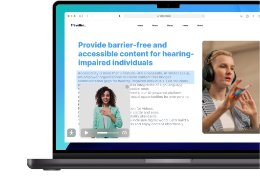
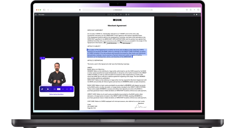
In today's digital age, auditory and visual accessibility are crucial factors to consider in designing any form of content or technology. Individuals with hearing or vision impairments rely on accessible features like captioning, screen readers, and high contrast settings to engage with the information presented.
By incorporating auditory descriptions and alternative text for images, designers can make their content more inclusive and reach a wider audience. Ensuring visual accessibility not only benefits those with disabilities but also enhances the overall user experience for everyone who engages with the content.
Font selection for users with low vision and impact on accessibility
Font selection plays a crucial role in accessibility for users with low vision. Choosing high contrast fonts and appropriate sizes can enhance readability. Fonts like Arial, Verdana, and Open Sans are recommended for their clarity and legibility. It is important to consider the needs of all users when designing for accessibility.
Compatibility with screen readers through font choices
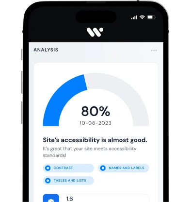
Checking Accessibility is an important step in ensuring that websites and digital content are usable by all individuals, including those with disabilities. Web developers and designers can use tools and guidelines to assess the accessibility of their work, making necessary adjustments to improve inclusivity and user experience.
By conducting accessibility checks, organizations can reach a wider audience and demonstrate commitment to diversity and equality. Implementing features such as alt text for images, keyboard navigation, and clear headings can make a significant difference in the user experience for all visitors.
Checking Accessibility
Checking Accessibility is an important step in ensuring that websites and digital content are usable by all individuals, including those with disabilities. Web developers and designers can use tools and guidelines to assess the accessibility of their work, making necessary adjustments to improve inclusivity and user experience.
Ensuring WCAG compliance for web design
When designing a website, it is crucial to ensure that it adheres to the Web Content Accessibility Guidelines (WCAG). This involves making sure that the website is accessible to all users, including those with disabilities. By following WCAG standards, web designers can create a more inclusive and user-friendly experience for all visitors.
Adjusting fonts for accessibility
Digital accessibility is crucial for ensuring that all individuals can access and navigate digital content seamlessly. One important aspect of this is adjusting fonts to make text more readable for those with visual impairments. By utilizing an accessibility checker, designers can easily identify areas where fonts may need to be adjusted for improved accessibility.
Common adjustments may include increasing font size, adjusting spacing between letters, and selecting fonts that are easier to read. By making these small changes, designers can greatly improve the accessibility checker of their digital content for all users, regardless of their abilities.
Conclusion
In conclusion, it can be surmised that incorporating regular exercise into daily routines is crucial for promoting a healthy lifestyle. The benefits of physical activity extend beyond just physical health and are essential for improving mental and emotional well-being as well. It is imperative for individuals to prioritize regular exercise for a long and healthy life.